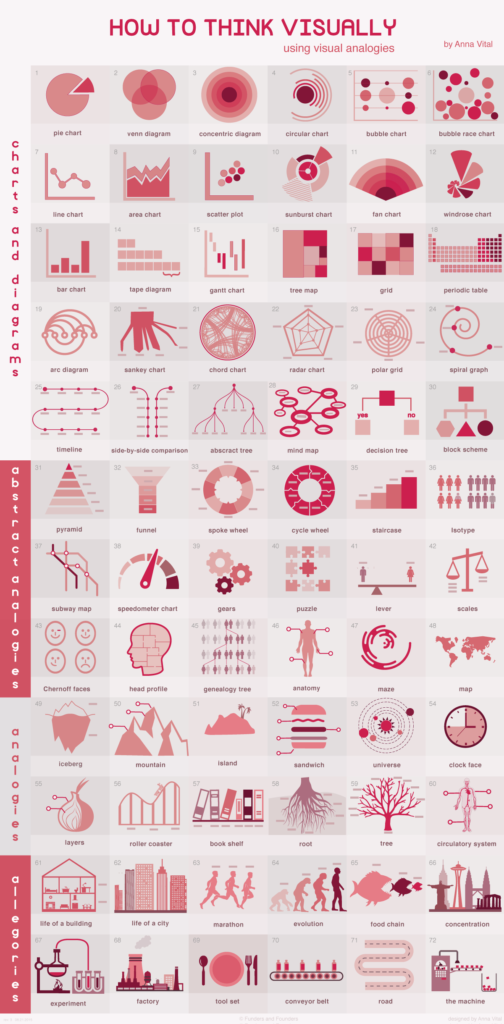
Complex information and data is often conveyed using a diagram or chart. How do you know the most effective model, and what are some creative ways to display them?
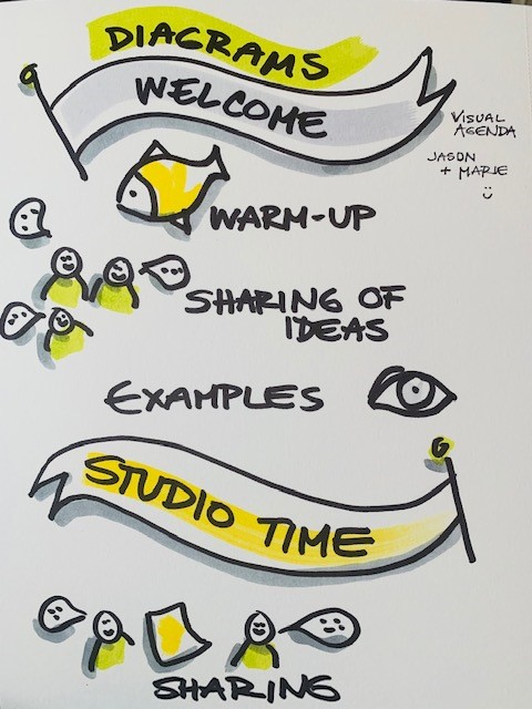
In the studio this week we will look beyond the diagram and explore allegories, analogies and metaphor as ways to make your diagrams more engaging. Work in this hands-on session to develop your visuals from a quick sketch, through the use of colour to a finished piece in your presentation. Opportunities to discuss visual learning activities will be included.
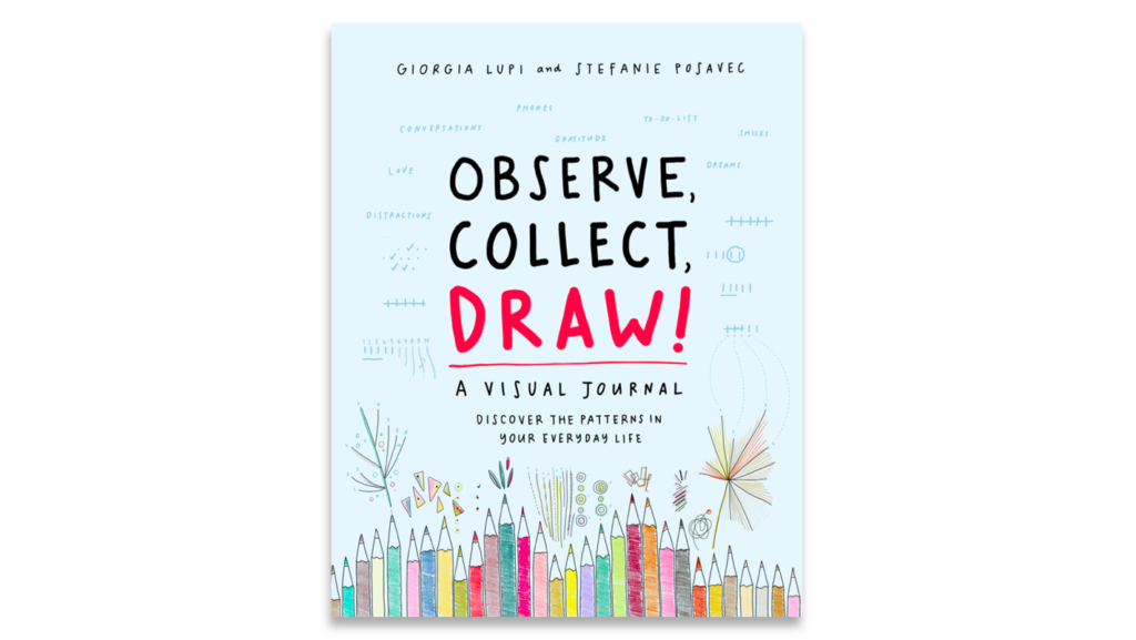
Warm ups – To warm up your drawing hand, you should again consider your lines. Variety, color, style, these factors and more can speak volumes. Of course now we are exploring data, information. There may not always be a story that is obvious. Observe, Collect, Draw! is chalk full of activities to keep pushing you visualization repertoire.
OBSERVE, COLLECT, DRAW! – A Visual Journal
Charts, Diagrams, Infographics and more eg. – There are many different formats of diagrams beyond bar and pie charts.
How To Think Visually Using Visual Analogies – Infographic